Tuesday, April 21, 2009

Laura Mulvey Explained

For those who are interested in Laura Mulvey work:


I published the internet article on Sunday to follow up on my presentation in Prof. Betty Brown class:


http://www.videodigitallive.com/lauramulvey/


that provides the detailed analysis of Mulvey's work "Visual Pleasure and Narrative Cinema". As I was reading the article and working on my presentaion, I realized that it's impossible to fully understand the content without in-depth structural analysis and the diagrams that illustrate the key points. So I followed through trying to resolve some contradictory aspects of her writing.


The current research attempts to explain the central part of Mulvey's article: "Desire, born with language, allows the possibility of transcending the instinctual and the imaginary..." , and it opens up a number of questions.


Analysis reveals the important points of Mulvey's writing:

  • The language of patriarchy affects woman's unconscious

  • The concept of Woman's Desire is a subject for further research.


The research also:

  • 1. provides the analysis of relationships between Freud and Lacan in reference to Modernism and Post-Modernism

  • 2. attempts to define the position of Mulvey in relationship to Freud, Lacan and Feminism.

  • 3. defines the central theme of her article - "new concept of desire"

  • 4. suggests further analysis of relationship between Mulvey's work, Lacanian psychology, and contemporary psychology (main aspects: woman's desire, castration complex, gaze, looking, self-awareness)

  • 5. suggests detailed analysis of the movie "Riddles of Sphinx"


Note: This research is in progress, so the list of the items to be continued. I'm extremely interested in further analysis of Mulvey's and Wollen's work, biography, historical research and the possibility of the interview. It would be also helpful to have a psychologist involved in the research.

The diagrams below provide:

a. historical background

b. overview of Lacanian psychology in relationship to Mulvey's work

c. in-depth structural analysis of Mulvey's work


Lacan:


Laura Mulvey:
Visual Pleasure and Narrative Cinema


Voyeuristic Scopophilia


Scopophilia in its Narcissic Effect (Lacan-Mirror Stage)


Cinema Contradiction


Pleasurable Structure 1 - Scopophilic


Pleasurable Structure 2 - Narcissism / Constitution of Ego


Mulvey makes an analogy between the world of the cinema and Freudian definition of pleasure as tension between instinctual drives. The diagram above corresponds to both the world on the screen (emotional tension between the movie characters) and the relationship between the cinema screen and the viewer.
She also makes an analogy between the cinema world and Lacanian definition of symbolic orders / stages of development : the viewer corresponds to the silent world of Real (instinctual) and imaginary (Mirror stage), while the screen is the analogy of Symbolic that produces language and desire.


"Desire, born with language, allows the possibility of transcending the instinctual and the imaginary, but its point of reference continually returns to the traumatic moment of its birth: the castration complex."


"Hence the look, pleasurable in form, can be threatening in content, and it is woman as representation/image that crystallises this paradox."
I think at this point it would be interesting to go back to her previous premise that looking represents self-awareness and do further analysis.
Saturday, February 21, 2009

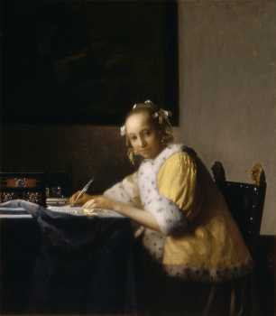
Vermeer's "A Lady Writing" at Norton Simon


I noted a few things about Vermeer's A Lady Writing when I saw the original painting at Norton Simon:

1. diagonal composition intersecting with the frame at the background, the direction of the look, and the immediacy of the moment captured draws the viewer into the piece;

2. softness of chiaroscuro and the size of the painting make it very intimate;

3. this painting certainly has some mysterious quality: there is undercurrent contrast/tension between the warm yellow coat the lady is wearing and the cold green color of the table cloth (lost in this reproduction); also, the light (from a window?) makes the viewer uncertain of the time of the day and the weather/season.

4. the painting is also about the look, and the way the lady is looking makes you guess who she is and the relationship between her and the viewer (artist).

I was hypnotized by the artwork.

Saturday, February 7, 2009

Animated Painting

OK, I'm back to blogging. I found the most interesting book at CSUN library "Animated Painting" published on the occasion of the exhibition in San Diego Museum of Art (2007-2008). Here is a list of work that I liked.

Barnstormers.

Letter to the President, 2003.
It's an anti-war political movie, a combination of animation and fast-forwarded live footage with the layers of painted images overlapping each other. The layers of meaning, merged together in the most creative way.

Jeremy Blake

Mod Lang, 2001
Abstract Digital Animation-transition of shapes and colors, meditative and almost philosophical feel. "To create these works, the artist would undergo an intense period of creative activity-what architects and designers call a charrette-resulting in series of drawings that convey the rhythmic ebb and flow of glacially moving forms." (Animated Painting)

Sodium Fox (2005)
Produced in collaboration with David Berman, this piece touches on childhood vs. corrupted adult world of politics: "Kidnap Yourself".

Sebastian Diaz Morales

Ring (The Means of Illusion), 2006-2007
It's a curved projection of four-channel video, a juxtaposition of the images of nature, crowd, and boxer. It has a psychological feel to it, and it reminds me some of the short stories of Jack London.

William Kentridge

Tide Table, 2003-2004
I love the work of Kentridge, everything looks so interesting in his handdrawn animated technique. It also has an old-fashioned feel of the early 20th cenury, that appeals to me.


Ann Lislegard


Bellona (after Samuel R. Delany, 2005)
I'm not a big fan of 3-D animation, but this piece has nothing to do with mainstreem movies. It has a very interesitng feel to it. "Although the work directly references the novel, Lislegard discards the human narrative and uses the story's architectonic structure as a metaphorical mise-en-scene to visually probe the cognitive gap between perception and apprehension, that slippery moment after seeing and before knowing". It reinforces the perception of the interior space, some alienation and search for inner self.

Serge Onmen

Counterfeiterphillanthrope, 2007
This is an installation piece tht seems the most interesting, but it's hard to fully embrace it in a DVD format, as most of the installation work.

Wit Pimkanchanapong

Untitled piece-digital animation-a play of black and white shapes overlapping each other. It reminds both modern avant-guarde art and op-art.

Qiu Anxiong

The New Book of Mountains & Seas, Part 2, 2007

It's a tranquil, meditative piece that reminds me Tarkovskiy's movie "Solaris". The transitions from space to cave paintings to nature refer to macro and micro reality. The movie is based on the ancient Chinese book Shan Hai Jing (dates from the third century BCE). "Taking the stories in the Shan Hai Jing as a theoretical basis for his animations, Qiu proposes the possibility that they cold be true in some form-that the book's magical creatures and imaginative chronology might have existed, although perhaps not in the miraculous states that the book describes. These stores developed from contemporaneous knowledge and served as explanatory models for understanding things beyond that era's technological capabilities: hence, the poetic accounts in Shann Hai Jing became the grand narrative in ancient China, the foundational truths that make the incomprehensible logical and believable". (Animated Painting)

Monday, May 21, 2007

Hammer Museum: Permanent Collection (Daumier)


Honoré Daumier collection is great. It's so contemporary! The lawers (c. 1860) haven't changes since then. He has a great talent of capturing the character and telling a story.

My other favorite piece is Don Quixote and Sancho Panza (c. 1866-1868). It has a great composition that certainly comunicates the aspects of materialistic and poetic.

Show at the Hammer Museum


I wasn't really impressed. My overall feeling is that Vija Celmins is a little bit obsessive. I like to look at the night sky, too, but why produce so many of them? Although I understand the artists who create their work for therapeutic reasons, that seems to be the case. She is very skillfull, though, and I liked some of her work that had political aspect.


Regarding the film by Austrian artist Mathias Poledna "Crystal Palace": It's nice to bring the nature into the movie theaters. But so what? It lookes like an attempt to be unique and experimental without having a great idea.


Erik van Lieshout is not my type of an artist, either. I like the art that has roughness to it, but I want to see a great idea and aesthetics, too. His stuff looked like another desperate attempt to be unique by a graduate student.

Georgia Rule


I certainly enjoyed it. The film is directed by Garry Marshall, and the cast includes Jane Fonda, Lindsay Lohan, Felicity Huffman, and Dermot Mulroney.

The film shows three generation of women in the family, and their past is unfolded in an interesting way. It's a very good attempt to analyze the characters. I also liked the contradiction of values between California and Idaho.

My mom made an interesting comment: "Why such whore women got such great guys?" That's a mystery to me, too.

Multimedia Festival at CTVA department, CSUN

It included the student work from web design and video/film classes. It was certainly very informative. I got a very good idea on how they teach web design, and I'm planning to take a class there to improve my skills.

In terms of the short films, I liked a lot of them. There way a n interesting short by Eric Jerome made in a silent black and white movie style.

The other one I remembered is called "If You Smoke, You Die" by Marten Weydah. The story is about a guy who is addictive to smoking and his girlfriend who is trying to stop him. Very Funny. Cigarettes play a lot of tricks with the poor guy, finding him anywhere...

The film I liked the most is called "Her Interests" by Chris Goodwin. It's a comedy about a very shy guy who is having trouble with dating/building relationships, and his friend who is trying to help him. It's hilarious.